In today’s digital world, your website is more than an online brochure. It is your salesperson, your brand reputation, your trust engine, and your conversion machine. But many businesses unknowingly sabotage their growth with simple, avoidable web design mistakes.
The good news? Fixing these issues can instantly boost user trust, session duration, sign-ups, and sales — without needing a full redesign.
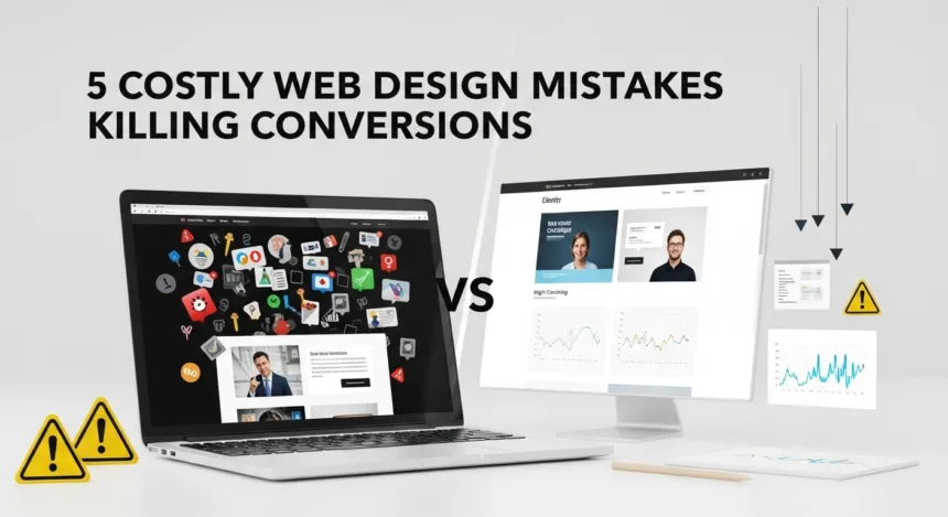
Let’s break down the 5 most costly web design mistakes killing your conversions and how to avoid them like a pro. You may also like to read: 7 Proven Web Development Secrets for Business Growth
✅ 1. Confusing Layouts That Overwhelm Visitors
A surprising number of business owners try to pack too much into their homepage — sliders, flashing banners, paragraphs of text, and random buttons.
But here’s the truth:
If a visitor can’t understand what you offer in 5 seconds, they will leave.
A cluttered layout increases bounce rates and destroys your conversion flow.
Why this kills conversions
-
Visitors feel stressed and leave quickly
-
They don’t know where to click
-
They lose trust because the site “feels unprofessional”
-
Decision-making becomes harder, not easier
The fix
Simplify your above-the-fold section:
-
Clear headline
-
Short value proposition
-
A single CTA (Book Now, Get Started, Learn More)
Simple design boosts clarity — and clarity boosts sales.
✅ 2. Slow Loading Speed That Chases Customers Away
People are impatient — and online customers are even more impatient.
Studies show:
Every extra 1 second of load time drops conversions by 7%.
If your website takes longer than 3 seconds, people abandon it instantly.
Why this kills conversions
-
You lose customers before the page even loads
-
Slow sites feel outdated and untrustworthy
-
Google ranks slow websites lower
-
Ad campaigns become more expensive because users bounce quickly
The fix
Speed optimization isn’t about technical jargon. It’s about improving user experience:
-
Compress images
-
Use modern hosting
-
Remove heavy scripts
-
Enable browser caching
A fast website = more conversions, more sales, more happy customers.
✅ 3. Weak or Unclear Call-to-Action Buttons
Even a stunning website won’t convert if your CTA is unclear.
Many businesses make these mistakes:
-
Hiding the CTA below the fold
-
Using vague text like “Submit”
-
Using low-contrast colors
-
Not repeating the CTA throughout the page
Your CTA should guide users like a GPS, telling them the exact next step.
Why this kills conversions
-
Users don’t know what action to take
-
Low visual emphasis = low clicks
-
Confusing wording reduces confidence
-
Missed opportunities for sales or sign-ups
The fix
Use CTAs that:
-
Stand out visually
-
Are repeated multiple times
-
Use persuasive, benefit-driven text like:
-
Book Your Consultation
-
Start Your Free Trial
-
Grow Your Business Today
-
Small changes to CTA design can increase conversions by 30–70%.
✅ 4. Poor Mobile Experience (The Silent Conversion Killer)
Over 70% of website visitors come from mobile devices, yet many business owners design their website only for large screens.
If your site looks great on desktop but broken on mobile, you are losing a massive amount of money.
Why this kills conversions
-
Buttons too small
-
Text too tiny
-
Elements overlapping on the screen
-
Slow loading on mobile
-
Hard-to-fill forms
A non-mobile-optimized design makes your brand feel outdated and frustrates visitors.
The fix
Your website must be:
-
Mobile-friendly
-
Touch-friendly
-
Easy to scroll
-
Simple to navigate
A smooth mobile experience can double your conversion rate overnight.
✅ 5. Not Building Trust With Social Proof & Branding
People don’t buy from businesses they don’t trust.
Many websites focus so much on visuals that they forget the biggest conversion booster: credibility.
A lack of trust signals leads to:
-
Hesitation
-
Abandoned carts
-
Reduced inquiries
-
Lower brand authority
Why this kills conversions
-
Visitors doubt whether your business is legit
-
They fear being scammed
-
They question the product or service quality
-
They prefer competitors who appear more trustworthy
The fix
Add trust elements like:
-
Testimonials
-
Client logos
-
Case studies
-
Certifications
-
Clear contact information
-
About Us section with real human faces
Trust isn’t optional — it’s essential for conversions.
✅ How Many of These Mistakes Are You Making Right Now?
Most business owners unknowingly struggle with at least 3 out of the 5 mistakes listed above.
And fixing them can:
-
Increase conversions
-
Reduce bounce rates
-
Improve customer trust
-
Boost sales
-
Strengthen your brand identity
-
Improve your Google ranking
-
Lower your advertising costs
You don’t need a full redesign — you need a smart design approach.
✅ Ready to Eliminate These Costly Mistakes? Sparktopus Can Help.
If you want:
✅ A high-converting website
✅ Professional branding
✅ Better user experience
✅ More leads and sales
✅ Fewer abandoned visitors
✅ A business website that truly works
…then your next step is simple.
👉 Book a Website Revamp or Full Web Design Service With Sparktopus Today
Let the experts handle the strategies that turn clicks into customers and visitors into buyers.
Your website shouldn’t just look good.
It should sell